
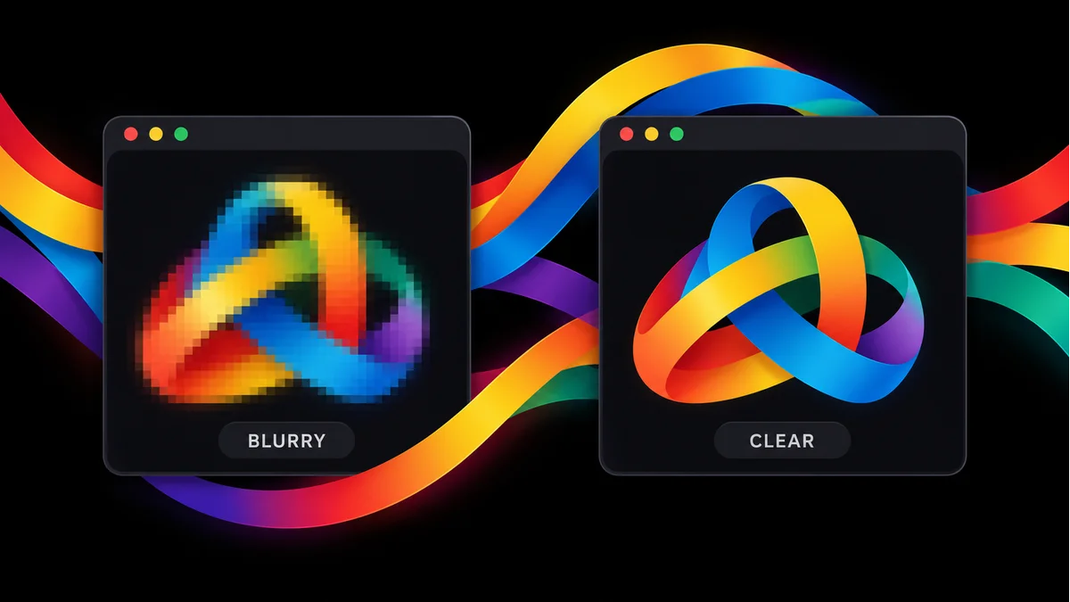
You upload your logo, open your website and notice that something looks wrong. The letters feel soft. The edges look rough. On your phone, the same logo may look even worse.
You do not always need a new logo. Often, the website uses the wrong file, shows it at the wrong size or loads a smaller copy than you expect. A few careful checks can help you find the cause without changing your whole brand.
This guide explains what to check, which file to use and how to keep your logo clear without slowing down your website.
The short answer
Your logo usually looks blurry because the image does not have enough detail for the size at which your website shows it. Heavy image compression, a poor export, the wrong file version or stretched display settings can also cause the problem.
Start with the original logo file. Compare its pixel size with its displayed size. Then check the actual image your website loads, especially on mobile. Fix the source before adding effects or uploading a much larger file.
1. Your website stretches a small logo
A PNG or JPG contains a fixed number of pixels. Think of pixels as tiny dots that form the image. When you ask a small image to fill a much larger space, the browser has to spread those dots across that space.
For example, a logo that measures 120 pixels wide may look soft when your header shows it at 240 pixels wide. Making the file larger inside an image editor does not bring back detail that the original file never had.
Open the file details and check its width and height. Next, ask your developer to check the size shown in the header. If the file is too small, export a fresh copy from the original artwork. Do not enlarge the small copy and expect a clean result.
2. A sharp screen needs more image detail
A logo can look fine on one laptop and soft on a phone. Some screens use several physical pixels to draw one pixel of your page layout. A file that just matches the layout width may not supply enough detail for those screens.
If you display a logo at 180 pixels wide, a 360 pixel image can be a useful starting point for a screen with a pixel ratio of two. The logo still appears at 180 pixels on the page. The extra image detail supports the sharper screen.
Your developer can provide suitable image versions so the browser chooses one for the screen. The MDN guide to responsive images explains this approach. Avoid sending a huge image to every visitor when a smaller, clear version will do.
3. You chose a file format that does not suit the logo
Different image formats suit different jobs. JPG often works well for photos, but its compression can leave marks around small letters and flat shapes. Those marks can make a logo look dirty or soft, especially against a plain background.
PNG keeps image detail without that kind of compression and supports a clear background. SVG stores shapes rather than a fixed grid of dots, which makes it useful for many simple logos. WebP offers more than one compression option, so its quality depends on the export settings.
You can read more in the MDN image format guide. For your own site, compare the actual files rather than choosing by the file ending alone. A badly made SVG or a small PNG can still look poor.
4. The file came from a screenshot or a small preview
A logo copied from a social profile, a chat preview or a screenshot may already have lost detail. Saving that copy as PNG does not restore the clean edges. It only saves the image you already have in a different format.
Look for the files your designer supplied when you approved the logo. Ask for a web version with a clear background and the original editable artwork. Keep those files in one folder so your team does not reuse an old preview by mistake.
If you only have a small image, our logo design service can help you plan a clean rebuild. A redraw should follow your approved design carefully, not replace it with a rough automatic trace.
5. Image compression removes too much detail
Your website may shrink images to help pages load faster. That can be useful, but a setting that looks fine on a large photo may harm a small logo. Thin letters and sharp colour changes often make the damage easier to notice.
Compare your original upload with the image the browser loads. If the upload looks clear but the served image looks soft, check your image plugin, theme or hosting image settings. Ask for a better quality setting for the logo rather than turning off all image changes across the site.
Keep a copy before you test. Change one setting, check the result and compare the file size. Your goal is a clear logo that loads quickly, not the largest file you can upload.
6. Your header squeezes or stretches the shape
Sometimes the image file is fine, but the header changes its shape. A wide logo may look squeezed when the page forces both its width and height into a box that does not match the original.
Keep the same balance between width and height. If you set the width, let the height follow the original shape. Check that the image fits inside its space rather than filling the box by stretching.
Also test the header before and after scrolling. Some websites switch to a smaller header when you scroll, and that version may use different image settings. Our responsive web design service covers layouts that need to work across screen sizes.
7. Your phone loads a different logo file
Many themes provide separate logo settings for desktop, mobile and a dark background. You might replace the desktop image while leaving an old, small image in the mobile slot.
Check each logo setting in your website editor. Look at the main header, the menu that opens on mobile, the footer and any header that stays visible while you scroll. Make sure each place uses the right version.
If those settings look correct, ask your developer to check the image address selected by the browser. A page can offer several image sizes while the browser chooses a smaller one because the size instructions are wrong.
8. The logo includes details that cannot fit
A logo with a long slogan, very thin lines or tiny text may lose its clear shape in a small header. A better file cannot make every small detail easy to read. The design may simply need a version for small spaces.
Try the main mark and business name without the slogan. For a tiny browser tab icon, use a simple symbol that people can recognise. Do not squeeze your full logo into every space just to keep every detail.
Our brand guidelines service helps define which version belongs where. Clear rules for size, spacing and backgrounds make it easier to keep the same quality across your website and other materials.
How to check your fix before you finish
Use the same short test each time you replace a logo. That helps you spot what changed and stops you from guessing.
- Open the original file and check its edges at its normal size.
- Confirm that the website uses the new image address.
- Check the logo on a phone and a desktop screen.
- Open the mobile menu and scroll to test any changing header.
- Check the logo against every background where it appears.
- Refresh the relevant cache if the old file still appears.
- Check the page load again after you change the image.
Keep browser zoom at its normal setting for your first comparison. Then test zoom as a separate check. A screenshot enlarged far beyond its original size does not show how the logo looks to a visitor at normal size.
Use our website launch checklist when you review the rest of the page. A clear logo matters, but visitors also need readable text, useful links and a working way to contact you.
Do you need a new logo or a website fix?
If the original artwork looks clean and the website version looks soft, start with the website settings. If every available copy looks blurry, you need a better source file or a careful redraw.
If the logo only struggles in small spaces, consider a simpler version before changing your whole identity. This saves time and keeps the parts of your brand that already work.
Not sure which problem you have? Talk to PictureArc about your logo and website. Share the page link and the best logo file you have. We can review the source and the way your website displays it, then suggest the next step.
Frequently asked questions
What is the best file format for a website logo?
SVG usually works well for logos made from simple shapes and letters. It can stay clear at different sizes. Use PNG when you need a transparent image and your site cannot use SVG. WebP can also work well if you choose settings that keep the edges clean.
What size should my website logo be?
Start with the space where you display it. A PNG shown at 180 pixels wide may need a width of 360 pixels for a screen that uses two image pixels for each display pixel. This is an example, not a rule for every website. Keep the height in the same shape and test your own layout.
Will changing my logo to 300 DPI make it sharp?
Not by itself. For a normal website image, check the actual pixel width and height and the size shown on the page. Changing a print setting does not add missing detail. Export a larger file from the original artwork when you need more pixels.
Why does my PNG logo still look blurry?
A PNG can still contain a poor image. You may have saved it from a screenshot, stretched it too far or uploaded a small copy. Your website may also serve a smaller version than the one you uploaded. Check the source file and the file your browser actually receives.
Can I turn a blurry JPG into a sharp SVG?
Changing the file name or placing a JPG inside an SVG does not rebuild the logo. Ask for the original vector artwork, or have a designer redraw the shapes and letters. Check the new result against your approved logo before replacing it.
Why does my old blurry logo still appear after I replace it?
Your browser, website cache or image service may still hold the old file. Confirm that the new image address appears in the page, then refresh the relevant cache. Test in a private window and on another device. Do not keep changing the design while checking an old copy.